Context
A strong story that showed up nowhere.
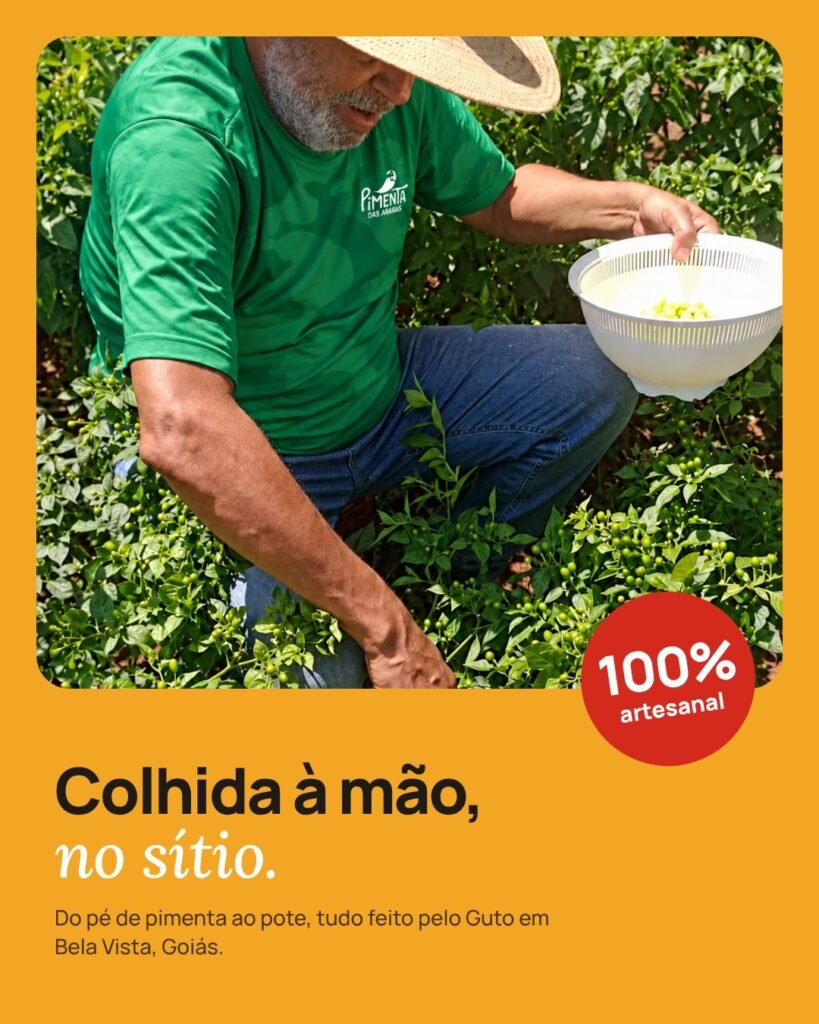
Carlos Augusto Falcão, known as Guto, swapped city life for a smallholding in Bela Vista, Goiás, in 2019. Growing chillies started as a hobby and became a business making artisan preserves.
Sales happened by word of mouth, on WhatsApp and at markets. The name Pimenta das Araras already existed: Guto created it, inspired by the blue-and-yellow macaws that land on the farm, drawn by the pequi trees. The brand’s only visual material was a simple label.
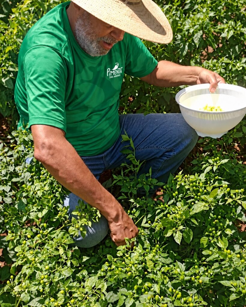
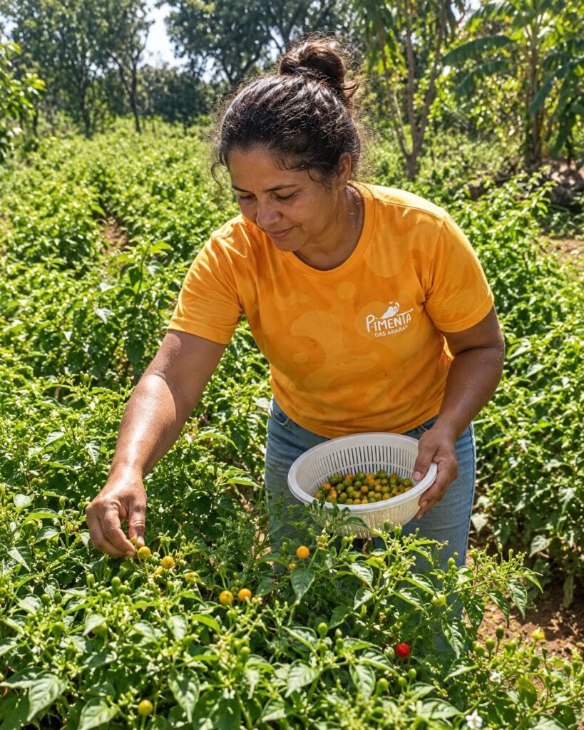
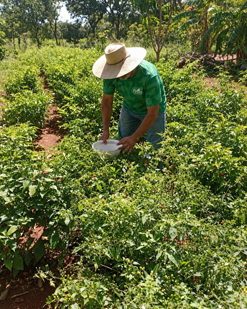
The harvest at Sítio Recanto das Araras, already in the brand’s uniform.
Diagnosis
The label was the symptom. The problem was that the brand didn’t exist beyond the farm.
The analysis showed an informal business, with an idle Instagram, no communication strategy and an identity that didn’t tell the story its own name promised.
Core problemBuilding Pimenta das Araras into a competitive, recognised brand, moving past informality and the lack of a digital presence, without losing its artisan essence.
How we got there
- analysis of the business and its current communication;
- direct and indirect competitors;
- three personas with empathy maps: families, chilli lovers and restaurant owners;
- market, trends and a SWOT matrix.
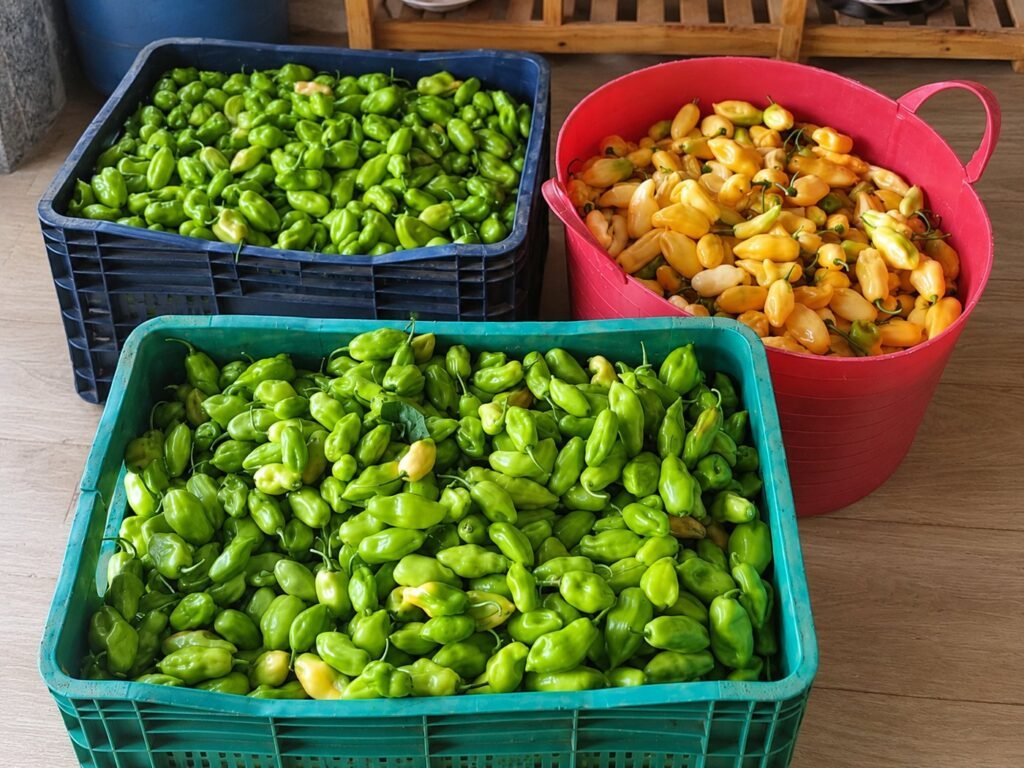
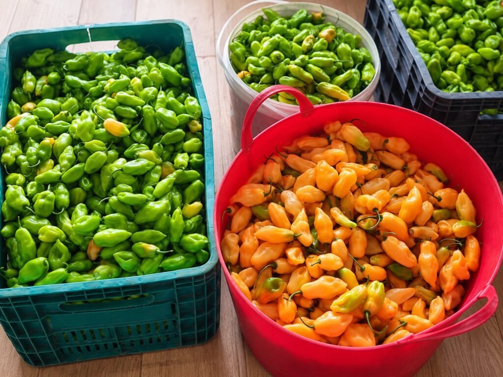
From the field to the crates: the harvest before it becomes preserves.
Direction
Start from the origin, not from a generic chilli.
Positioning
The artisan chilli that revives Goiás tradition with quality, authenticity and sustainability.
Concept
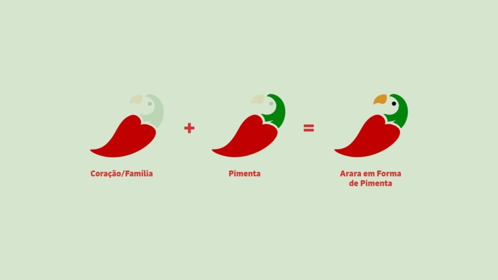
Guto’s emotional bond with Sítio Recanto das Araras. The symbol joins the macaw and the chilli, with the heart as a sign of family.
Message
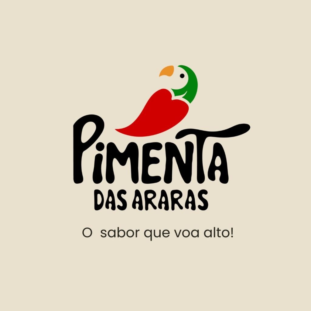
"Authentic flavour that connects and inspires." Tagline: "The flavour that flies high."
Visual system
A system to be used, not just to be looked at.
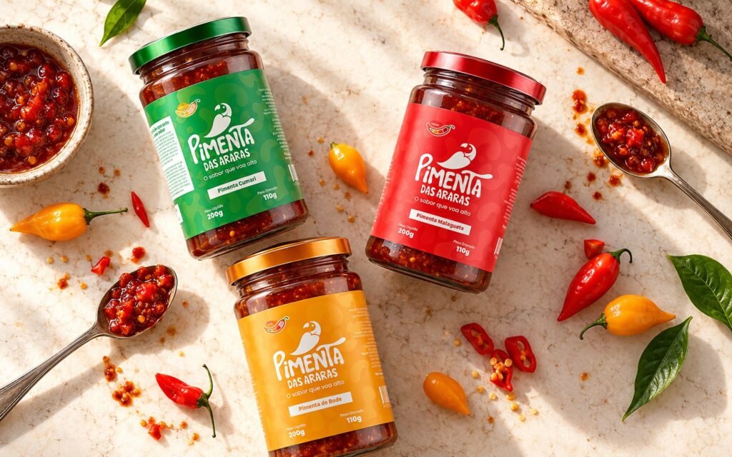
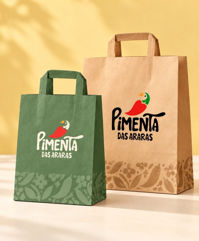
- Logo and symbol: a macaw in the shape of a chilli, with construction grids, clear space and maximum reduction.
- Palette: red, green and yellow, with supporting tones, linked to the chilli, the growing and the heat.
- Typography: Signo for headings, Poppins for text.
- Supporting identity: patterns of seeds, chilli drops and leaves from the cerrado.
- Visual identity manual with versions, correct and incorrect uses.
Labels
A label that tells where the chilli comes from.
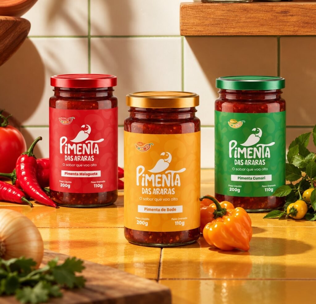
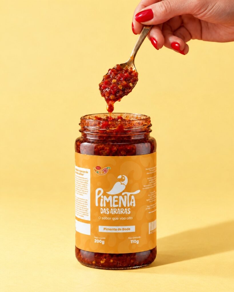
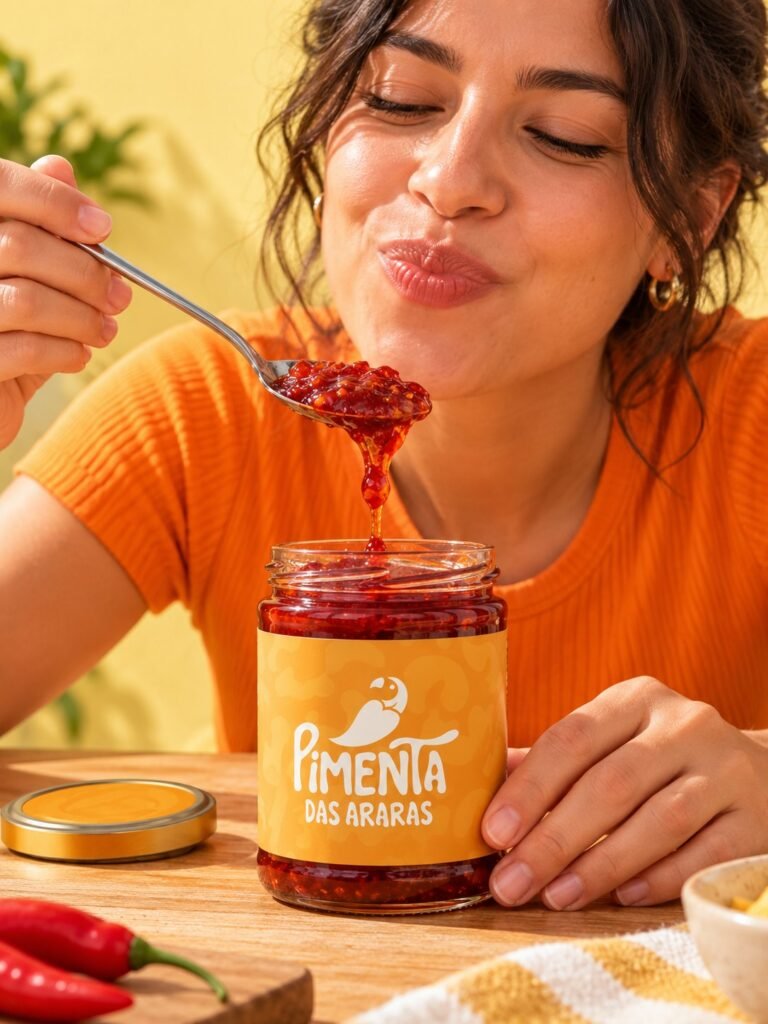
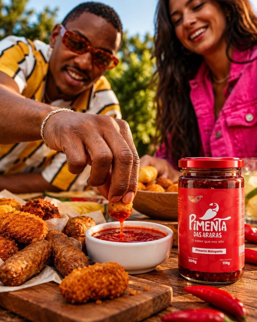
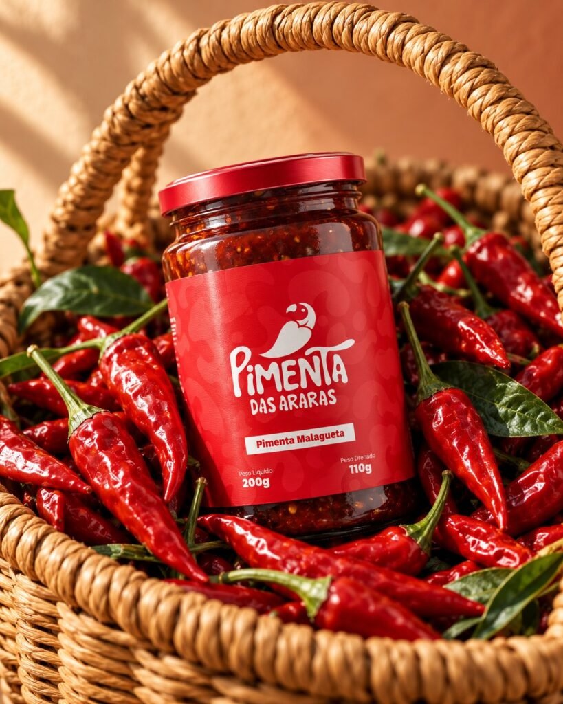
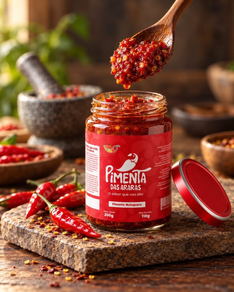
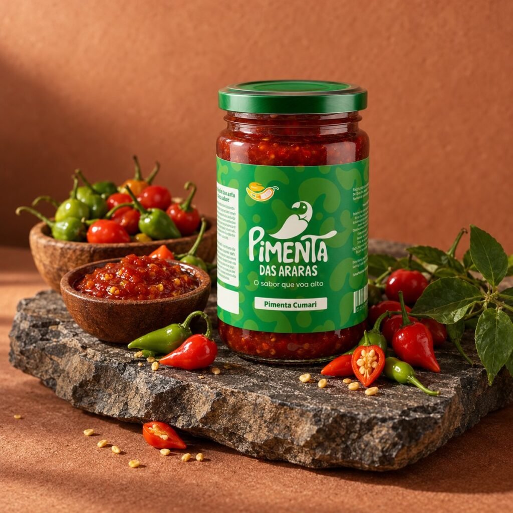
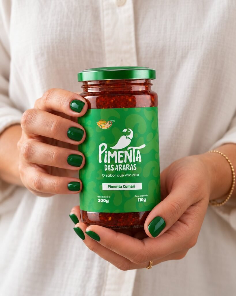
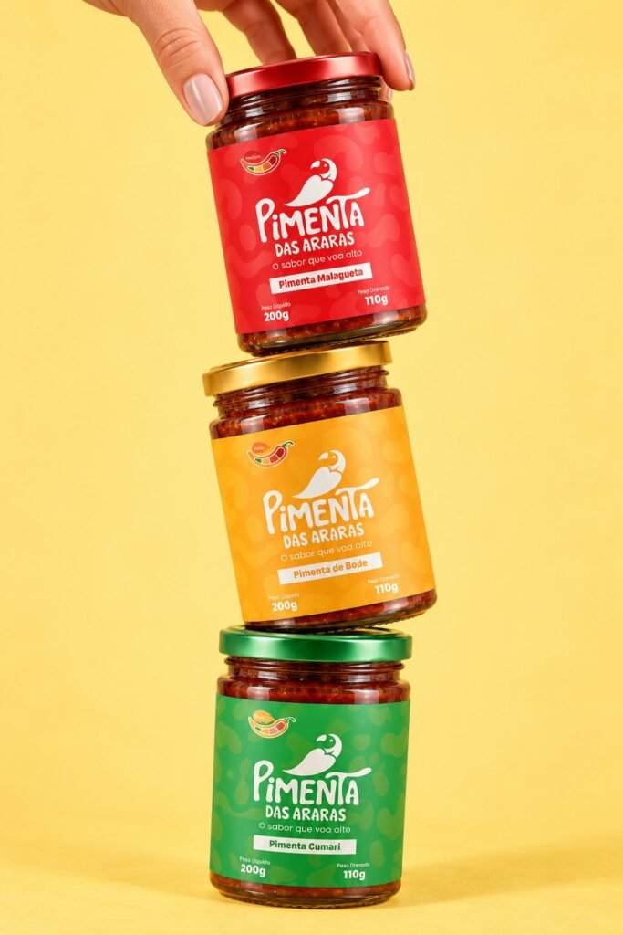
A family of labels: the colour changes with each flavour, the structure stays the same.
Applications
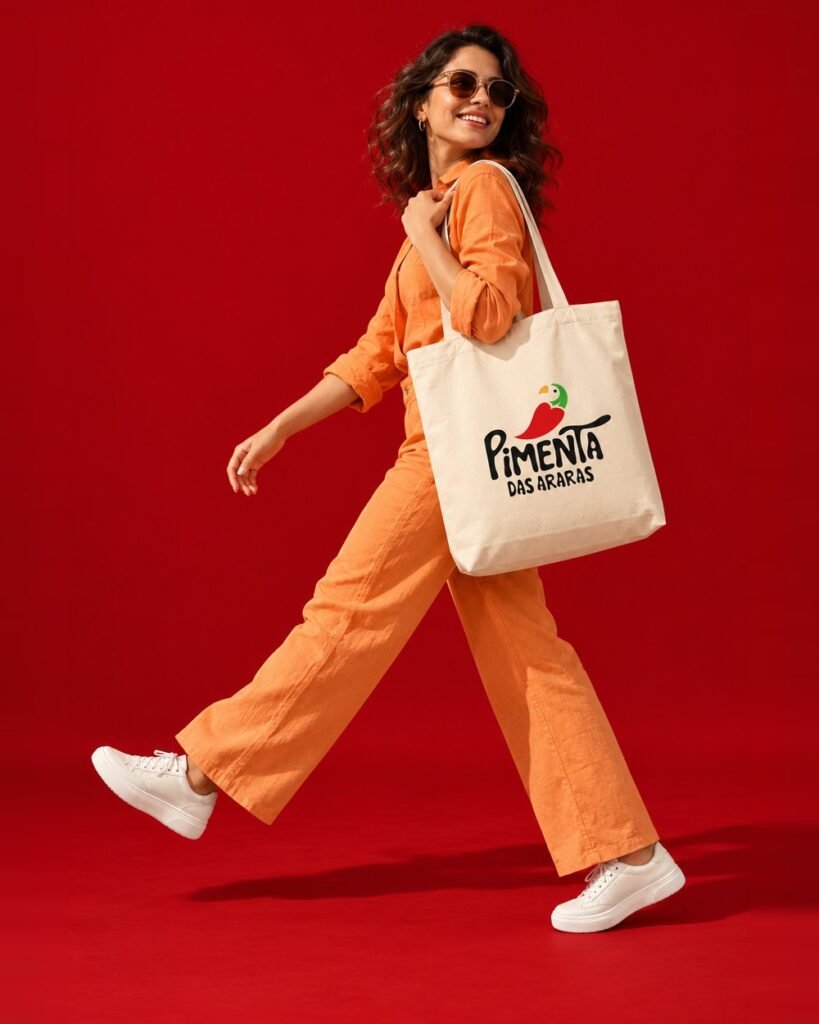
The brand across all of Guto’s touchpoints.
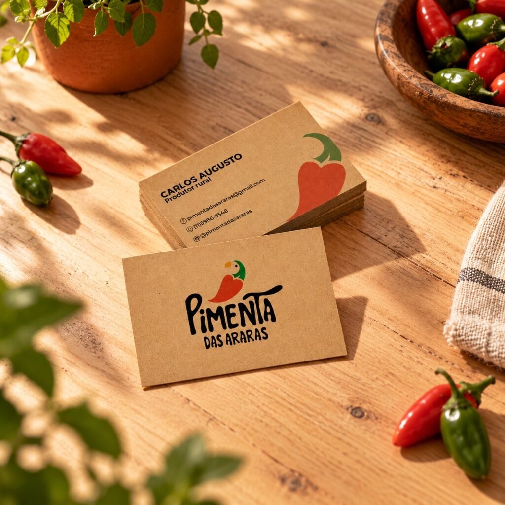
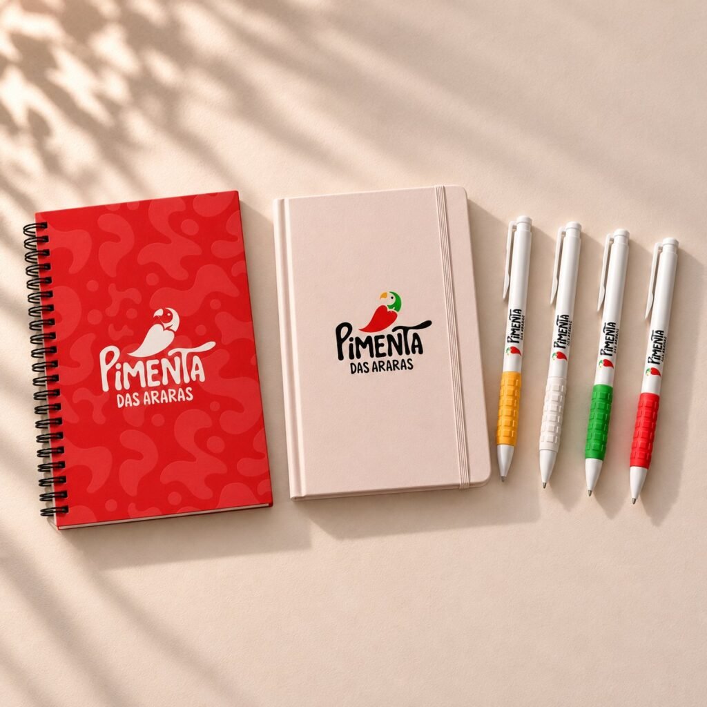
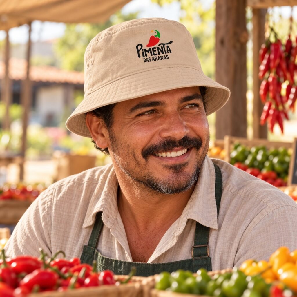
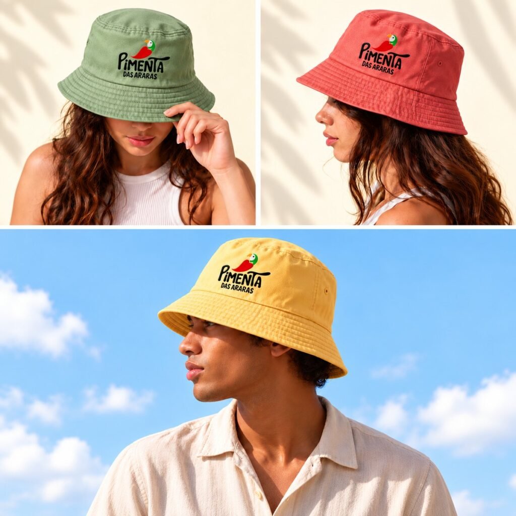
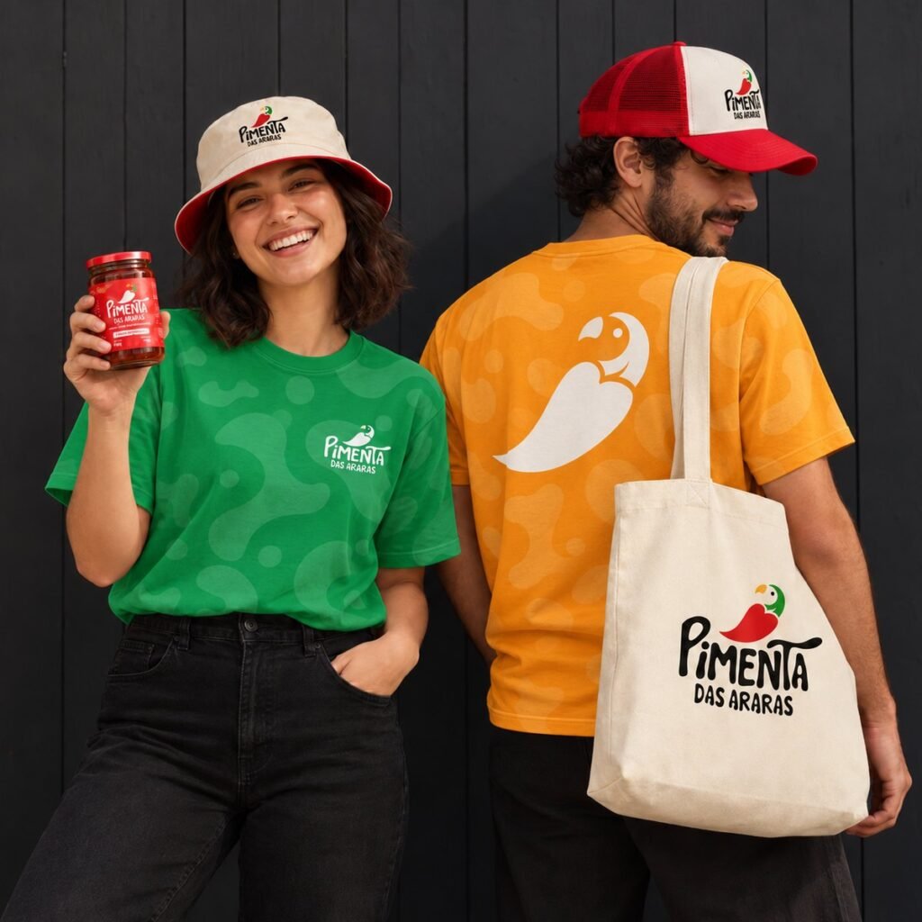
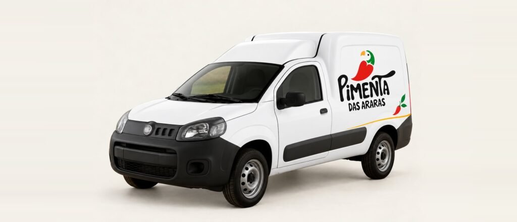
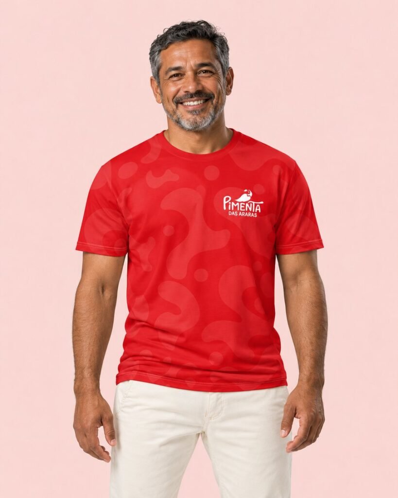
Labels and packaging, tray, business card and stationery, uniform, cap, tote bag, mug and delivery vehicles.



Communication
From the story to the feed.
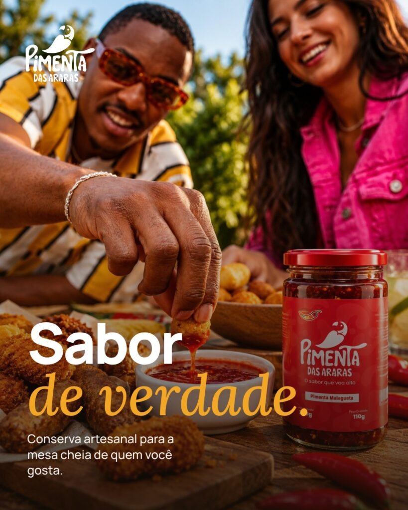
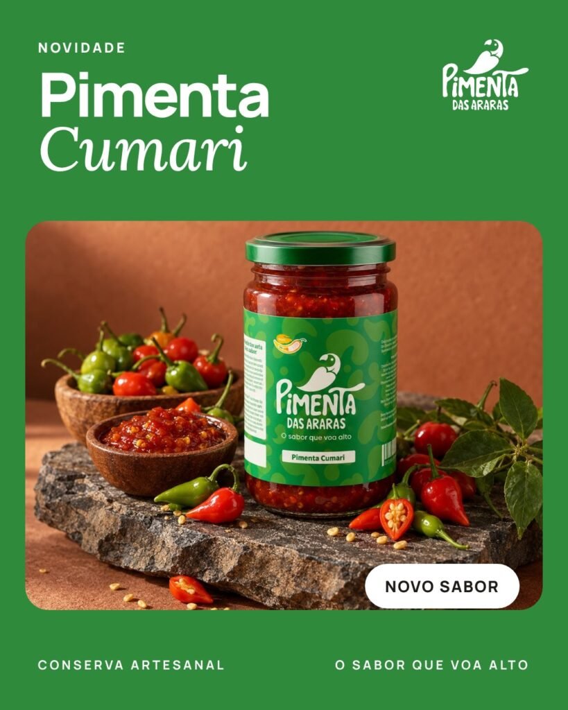
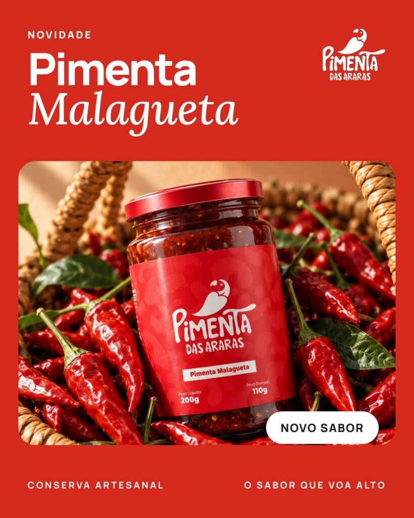
Alongside the final project, in the Digital Marketing module, the group took the brand to social media:
- a report on the current social channels;
- brand storytelling;
- a digital marketing canvas and growth strategy (proposal);
- Instagram posts for @pimentadasararas: campaign, causes and humour.
Result
What the project delivered.
- A diagnosis that separated the symptom (the label) from the core problem (a brand with no structure).
- A complete identity system, with a manual and production-ready applications.
- A proposal for digital presence and growth.
- Final project passed with an overall grade of 9.5/10.
What’s left as the next stepRolling out the identity and the strategy is up to the business. This case shows the proposal, not sales results.
Team: Hemerson Dazilio, Sabrina Pissurno de Oliveira and Sthefanny Moreira Mota.
Supervisor: Prof. Ricardo José Barbosa Olimpio, MA. Digital Marketing: Prof. Domitila Maria de Castro Carolino, MA.
Client: Carlos Augusto Falcão, Sítio Recanto das Araras, Bela Vista (Goiás, Brazil).
Faculdade Méliès, Bachelor’s in Design, 2025.