Context
A studio built to exist on paper before it existed in the market.
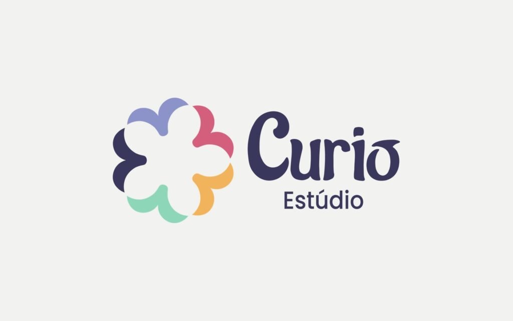
Curió is a fictional design studio, created by the group in the Visual Identity module. The brief was an original, Brazilian identity. Later, the same identity was reused in the business plan and in the Pimenta das Araras final project.
Concept
Creativity that connects and delights.
The concept started from three words: creativity, connection and delight. Creativity led to "curious" (curioso); curious led to Curió, a Brazilian bird known for its song.
The bird’s flight became the central idea: creative freedom and movement. Together, the fluid shapes of the flight form a flower, the delight.


Visual system
A symbol that flies and blooms.
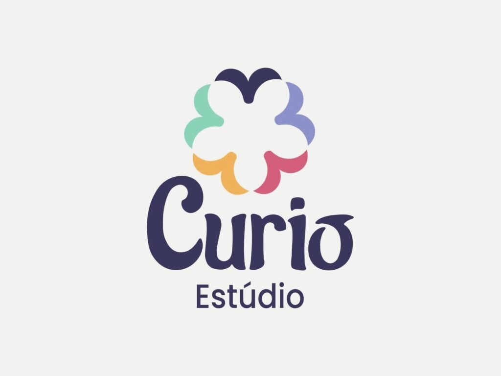
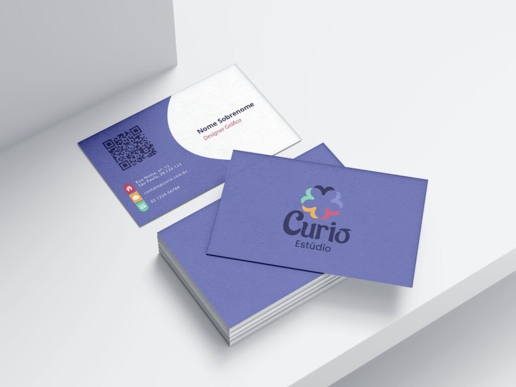
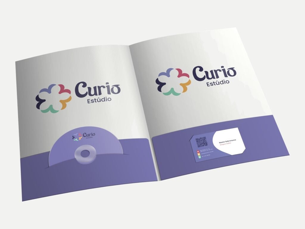
- Symbol: fluid lines like wings in motion, forming a flower; built on a grid, with clear space and minimum size.
- Palette: purple, pink and yellow as primaries; light green and dark blue as secondaries, with codes for screen and print.
- Typography: Raleway (headings), Poppins (subheadings) and Merriweather (text).
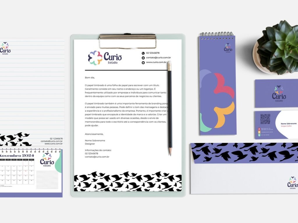
- Graphic element: a flock of birds in an expanded, deconstructed pattern.
- Versions: positive and negative, single colour, greyscale and outline, with incorrect uses and use on backgrounds.
Applications
From stationery to Instagram.
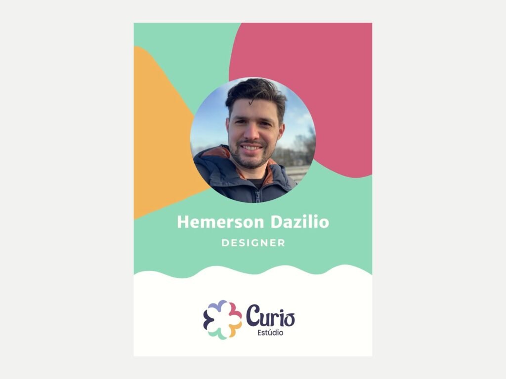
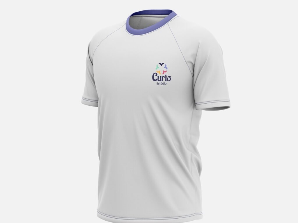
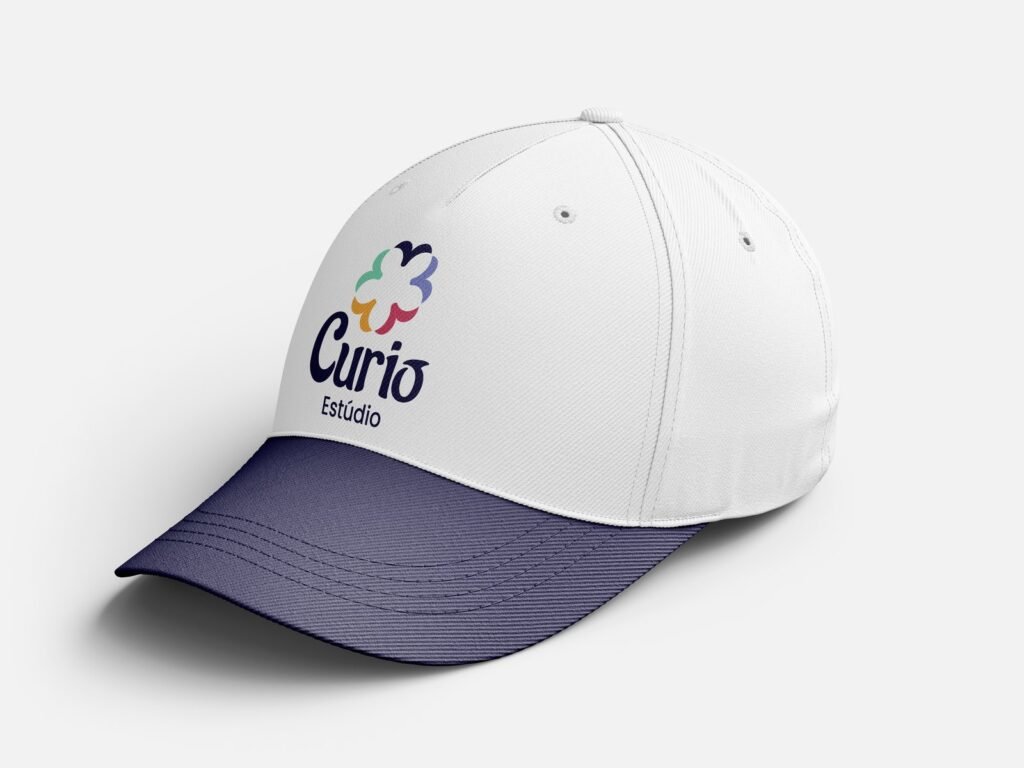
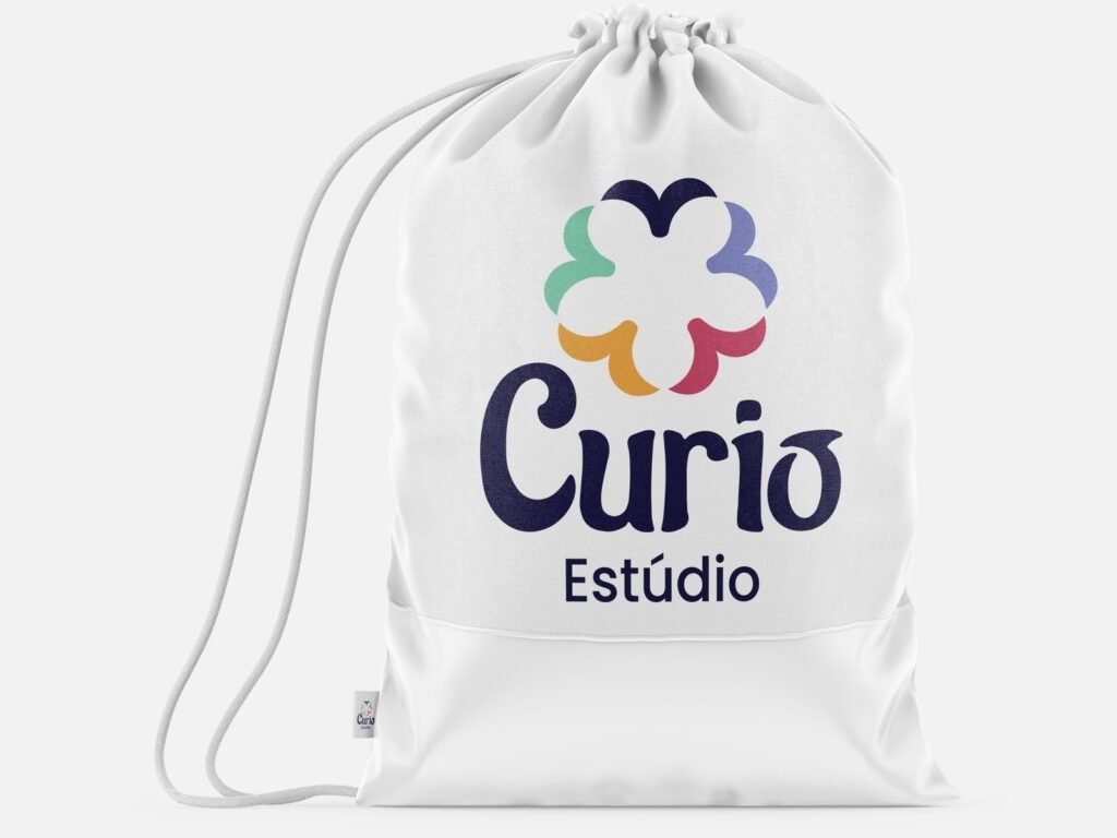
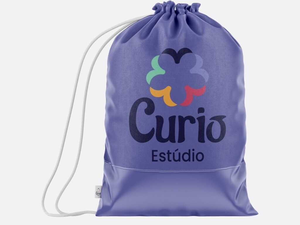
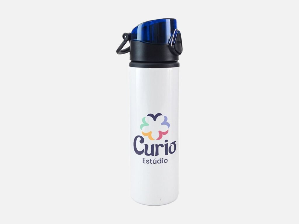
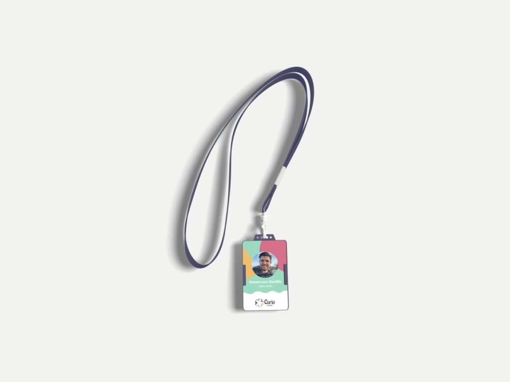
Letterhead, envelopes, business card, folder, calendar, uniform and ID badge, cap and water bottle, bag, email signature, website and Instagram.
From studio to business
The identity also had to make sense as a company.
The following year, the group structured Curió as a business in the Entrepreneurship and Law module: business type, market, competitors, audience, operations and projections. And the studio went on to sign the Pimenta das Araras final project.
Result
What the project delivered.
- A complete identity, from the name to the manual.
- A system used again in the business plan and in the final project.
- Final grades: Visual Identity 8.5/10; Business plan 10/10.
What this case is notCurió is an academic studio and never traded. This case shows the identity process, not clients or revenue.
Team: Hemerson Dazilio, Sabrina Pissurno de Oliveira and Sthefanny Moreira Mota.
Visual Identity: Prof. Rene Batista de Almeida, MA. Business plan: Prof. Juliano do Amaral Carvalho, MA.
Faculdade Méliès, Bachelor’s in Design, 2024–2025.