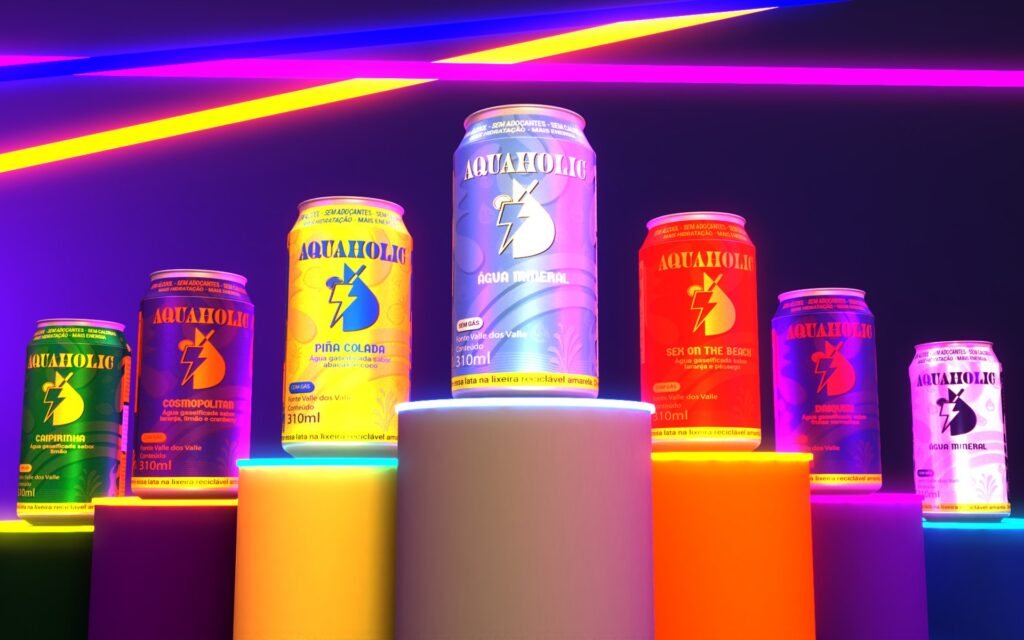
The idea
Hydration in the middle of the party.
At parties and festivals, almost everything sold to drink contains alcohol. Aquaholic was born as an alternative: still and sparkling water, plus waters flavoured like cocktails, with no alcohol. The idea is fun with responsibility.
Name and tagline
Refresh your fun!
The name plays on "alcoholic": aqua (water) + holic (addiction). The tagline takes the same idea into the communication.
Identity
A symbol made of party and water.
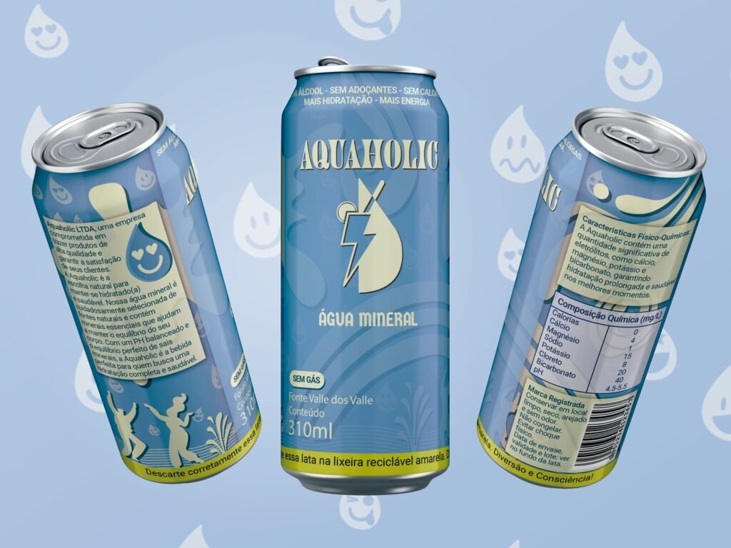
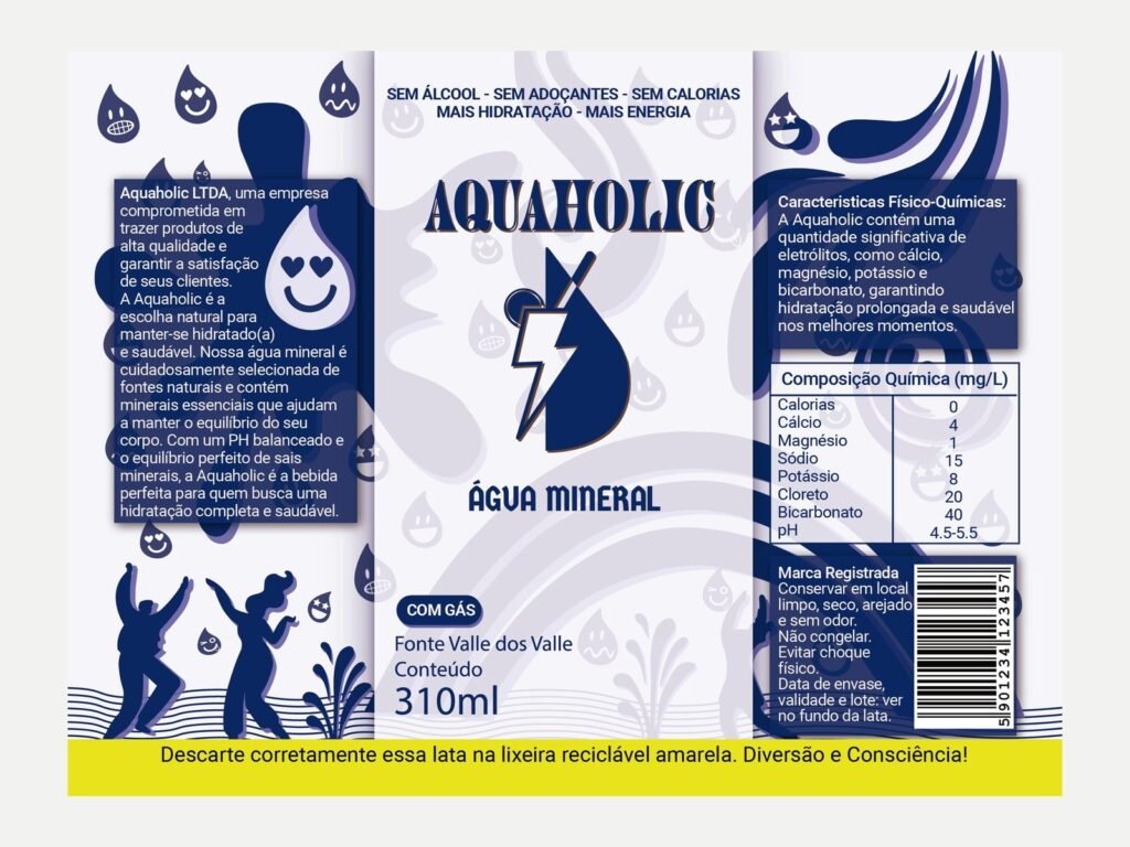
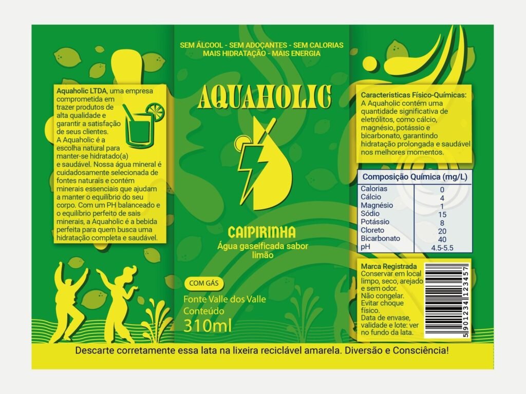
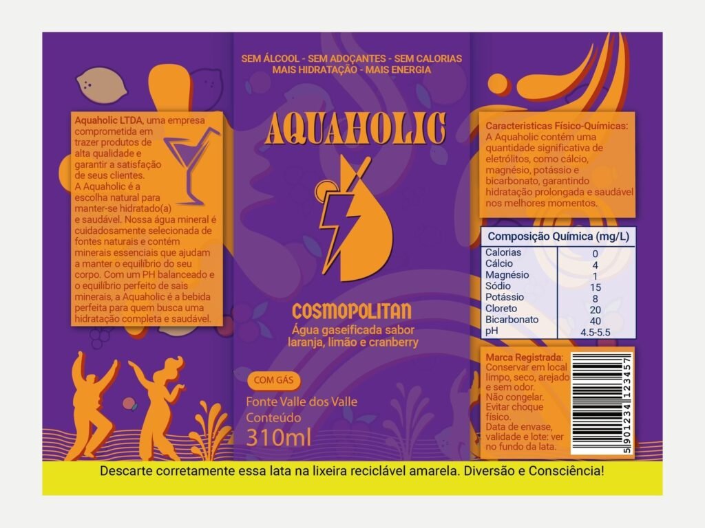
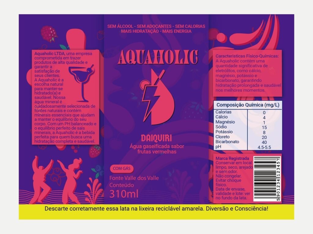
- Symbol: combines electrolytes, a drop, sliced fruit, a glass and a straw.
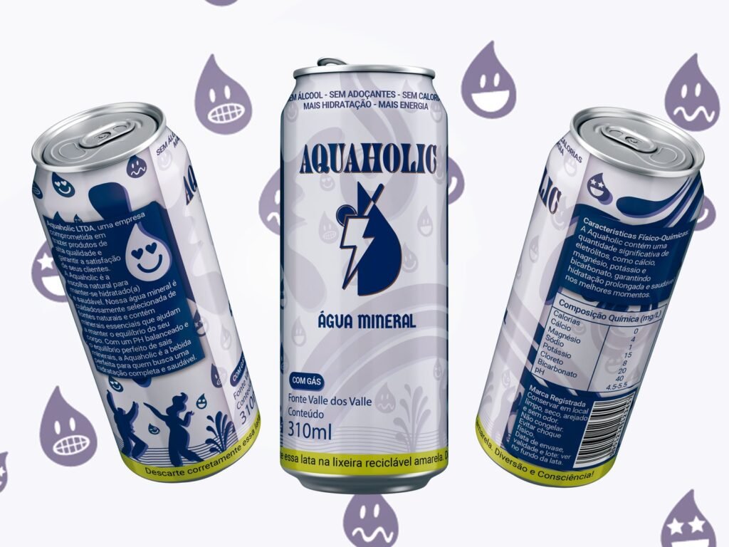
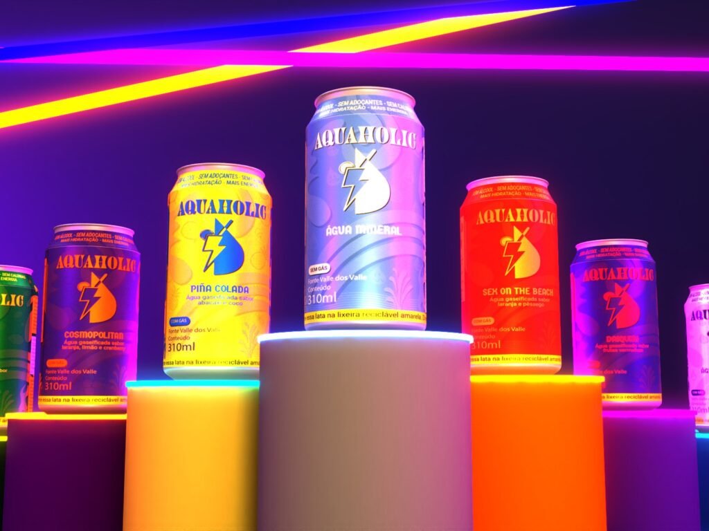
- Palette: one colour per product: still water, sparkling water and a shade for each cocktail (Sex on the Beach, Caipirinha, Piña Colada, Cosmopolitan and Daiquiri).
- Typography: Juniper (headings), Germania (subheadings) and Roboto Slab (text).
The label as a system
One rule repeated across the whole range.
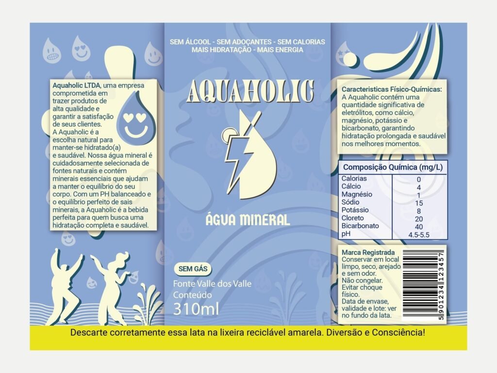
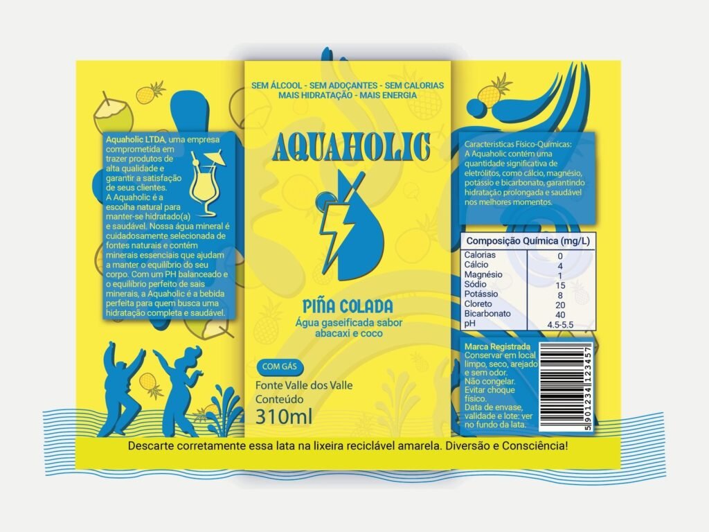
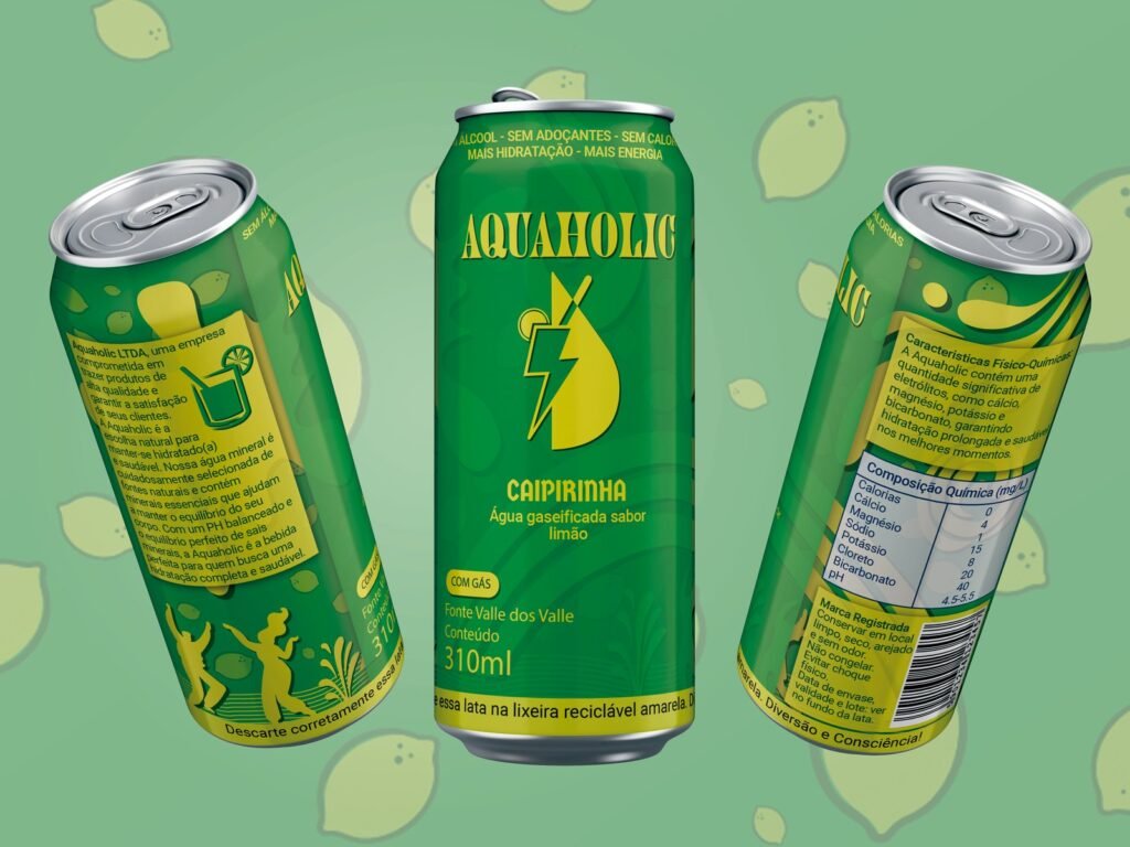
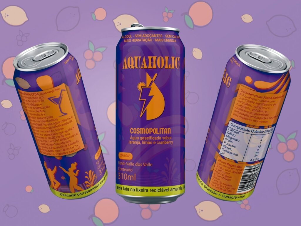
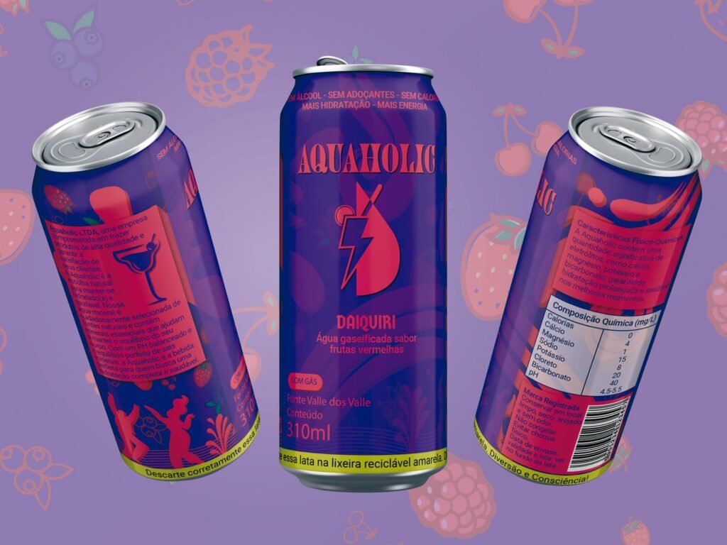
Every can follows the same structure: the shape of the cocktail, the fruit, the nutrition table and the disposal guidance, a yellow stripe that points to the metal recycling bin. The colour and flavour change; the rule stays.
Communication and event
From the can to the street and the festival.
- Instagram posts.
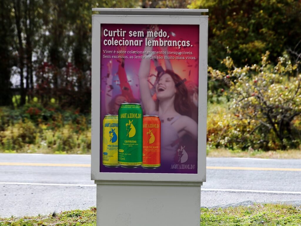
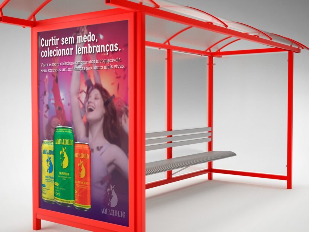
- Street furniture posters.
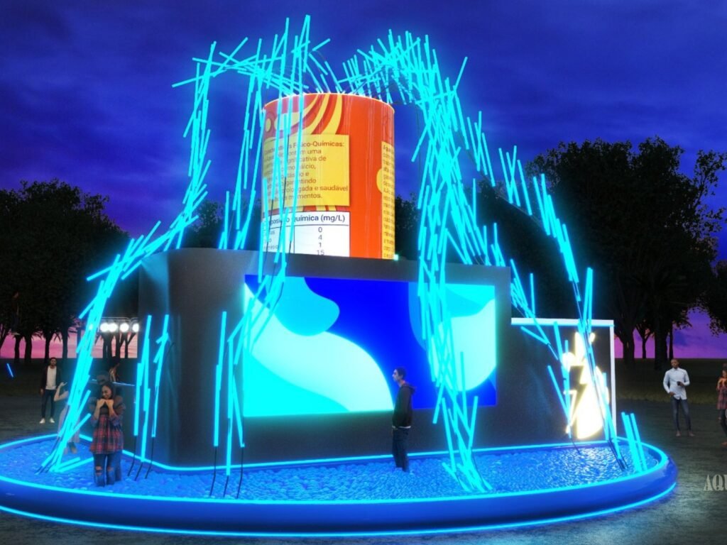
- A 3D event stand (8 × 8 × 6 m), with a ball pit, a giant can and a big screen.
Result
What the project delivered.
- A complete brand, with a label system applied to seven products.
- Final grade 10/10 in Integrated Project I and in Reading and Writing (the brand manifesto).
What this case is notAquaholic is a concept product. It was never made or sold, and the benefits described in the manifesto are part of the proposal, not of a real product.
Team: Hemerson Dazilio, Sabrina Pissurno and Sthefanny Mota.
Integrated Project I: Prof. Rene Batista de Almeida, MA. Reading and Writing: Prof. Vivian Suarez Martins, PhD.
Faculdade Méliès, Bachelor’s in Design, 2023/1.
Poster photo: stock image.