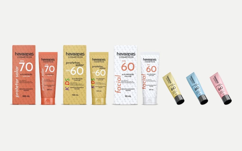
A speculative academic project. There is no link to, commission from or approval by Havaianas.
The challenge
Taking a strong brand into a new category.
The Packaging Design module asked for a brand extension. The group chose to imagine a sun care line for Havaianas, a brand born of summer and the beach.
Understanding the brand first
Before the packaging, the brand.
The project started with research:
- the brand’s history, from 1962 to today;
- the product range and points of sale;
- the audience, aged 18 to 35;
- two competitors in the category, Sundown and Cenoura & Bronze, compared on palette, typography and audience.
The research showed what the line needed to keep to remain Havaianas, and where there was room to stand out from competitors.
Concept
"Everyone wears them", now in the sun too.
The idea was to take the Havaianas motto into sun protection: products for the whole family, from faces to children.
Packaging system
One rule that sets each product apart and keeps the brand.
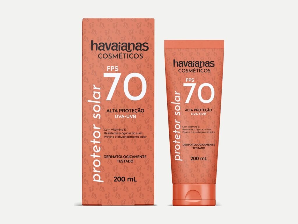
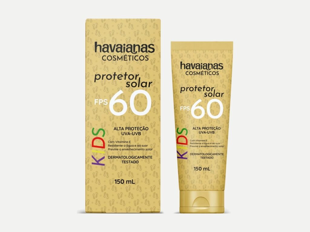
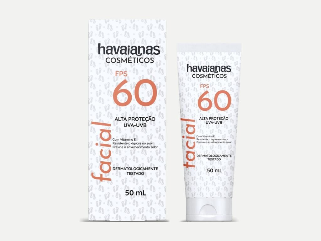
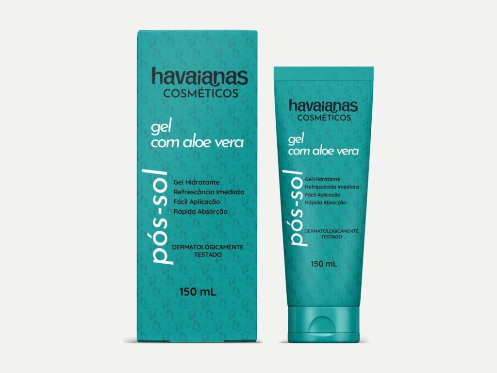
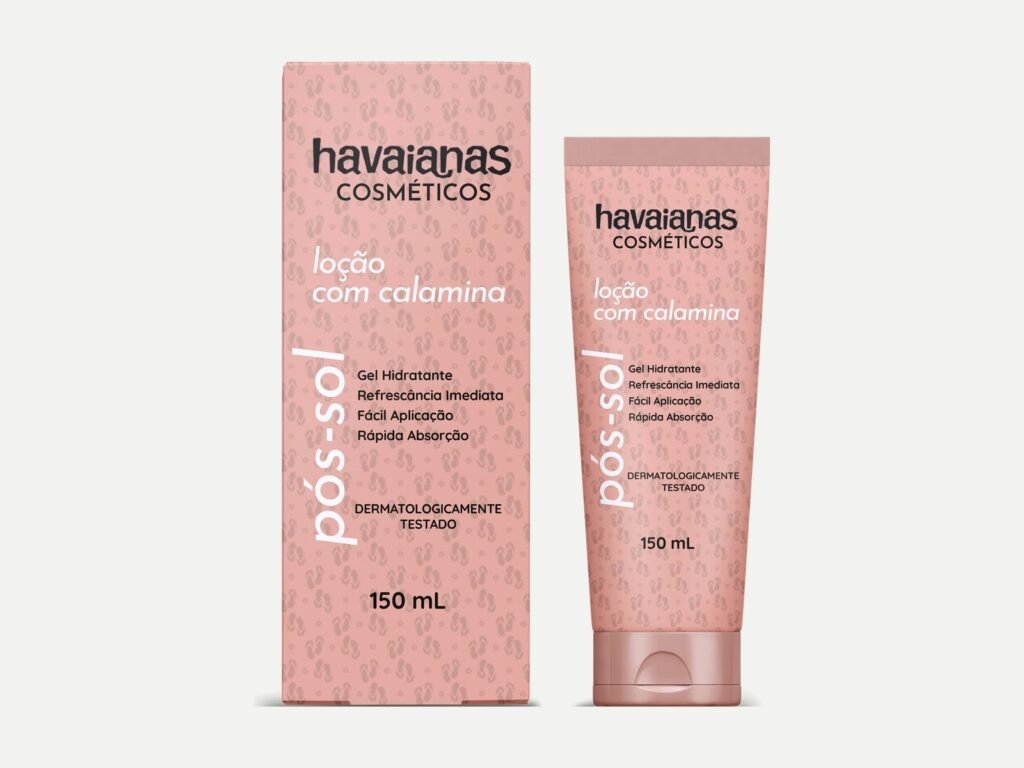
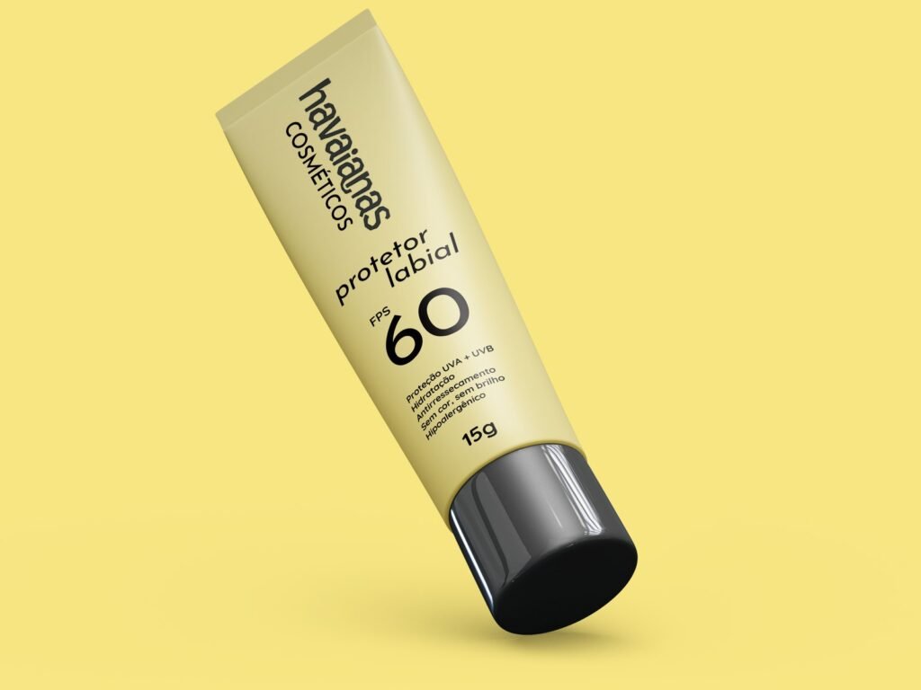
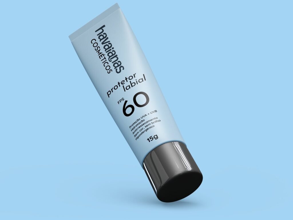
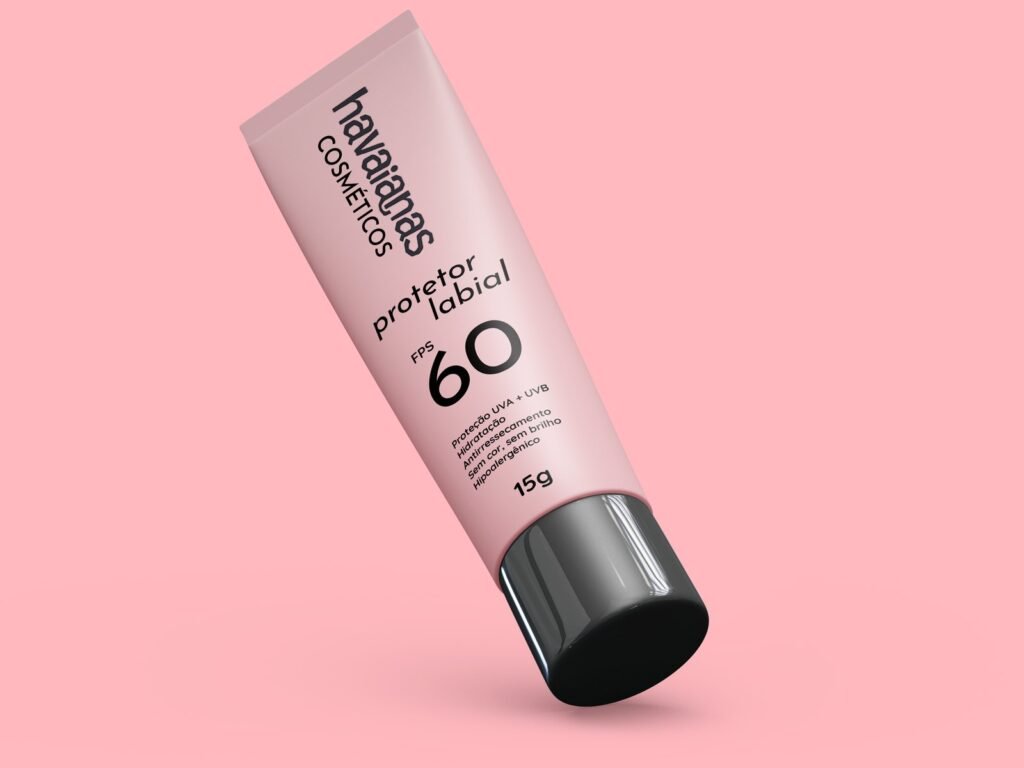
Colour and scale set each product apart. The name and the brand’s visual codes stay the same across the line.
The family includes:
- SPF 50 and SPF 70 sunscreen;
- Kids SPF 60;
- Face SPF 60;
- after-sun;
- lip balm in three colours.
Its own pattern
A flip-flop that becomes a print.
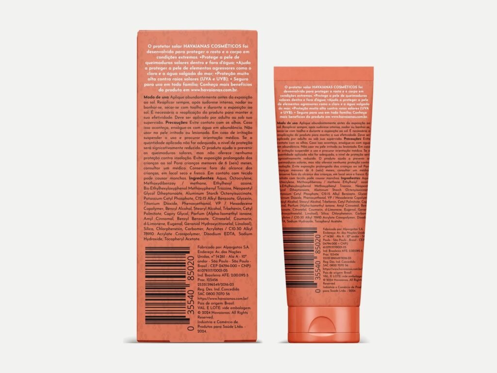
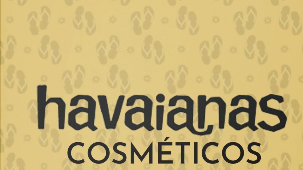
A pattern drawn from the shape of the flip-flop ties the line together.
Result
What the project delivered.
- Brand and competitor research turned into a packaging system.
- A family of packaging with the same visual rule.
- Final grade 10/10.
What this case is notIt’s an academic exercise. The products don’t exist, and the SPF numbers are part of the exercise, not a real formula. The Havaianas logo belongs to the brand and appears only as part of the study.
Team: Hemerson Dazilio, Sabrina Pissurno and Sthefanny Mota.
Packaging Design: Prof. Angela Vido Nadur, PhD. Faculdade Méliès, Bachelor’s in Design, 2024/1.
Mockups: free templates (frames only).